When it comes to clothing design, the possibilities are virtually limitless. Whether you’re crafting custom apparel for your brand, organization, or simply a personal project, one key aspect that demands careful consideration is the size and placement of your logo.
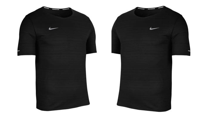
A ubiquitous practice in the fashion industry is the inclusion of a left-chest logo on garments like T-shirts. This placement has become a hallmark of professionalism and style. So, if you’re gearing up to design and sell your own line of shirts, it’s essential to stay in step with this trend.
In this article, we’ll delve into the art and science of determining the perfect size and placement for your left-chest logo.
By the end, you’ll have a clear understanding of how to make your T-shirt design stand out, leaving a lasting impression on anyone who wears it or sees it.

Let’s explore the optimal dimensions and positioning for your T-shirt logo.
What Is The Ideal Proportion For A Logo To Be Printed On A T-Shirt?
If you want to sell T-shirts, you should surely think about the positioning of the print on the chest area of the shirt, as well as the size of the logo.
A merchandising company, will opt to position their logo on the left breast. Usually the size of it is roughly 3″ x 3″.
Most major retailers are responsible for popularizing this trend. That is, basic T-shirts having the logo at this particular design size.
These days, you can find designs like this printed on polo shirts and junior shirts. They all position them on the left side of the chest. The same principle applies to work shirts that staff members at restaurants and bars wear.
Why though, do many businesses want their logos to be visible on the left chests by people who work for them or buy their products? What is the first thing that comes to mind when you look at the left chest logo? What kinds of ideas do you have running through your head?
Why Is It Popular To Wear Logos On The Left Chest?
There are a wide variety of customization possibilities for left chest logos. The left chest is the preferred location for a company logo by the overwhelming majority of businesses. Even influential people on social media prefer this option.
What is going on here? Why do we choose the left side and not the right?
In fact, 89% of brands favor the left chest logo placement, but why?

People usually have a preference for designs that are “minimal”. They are more likely to buy and wear t-shirts with a minimum amount of design work if it has a left chest placement on the garment. It appears that a simple pattern placed on the left chest works best. This is because the viewer’s attention is drawn to it.
As a direct consequence of this, people will notice your design. In addition, trademarks on the left chest are more likely noticed. As a result, the recognition of your logo grows over time.
It’s observed an emblem or logo placed on the right chest is more distracting.
Other reasons why shirt logos tend to be on the left:
- Historically military coat of arms and medals have always been placed on the left.
- Most people shake hands with the right hand. While reaching out, this covers up the right chest area. Whereas the left area stays open to sight.
- In most parts of the world we tend to read from left to right. So anything on the left tends to catch our attention. Similarly this is why logos are placed to the left of websites.
Finding the Right Logo Proportions for Different Shirt Sizes
When it comes to t-shirts that have custom logos printed on the left breast, you need to consider how the size of the logo will appear on a range of sized shirts. The design sizing will vary depending on the shirt size.
Because of this, 3.5″ logos appears different when printed on men’s extra-long t-shirts compared to a small t-shirts that are available for women. This also applies between an adult shirt and a youth shirt.

Therefore, before you can even begin to think about your left chest design, you need to have a clear grip on the individuals you want to attract and the sizes of T-shirts they are most likely to buy. This is something you need to do before you can even begin to think about your left chest design.
The size of the chest logo you choose will always be determined by the size of the T-shirt you purchase. Your design for the left chest of your promotional T-shirt should be three inches by three inches in size since promotional T-shirts are often simply plain-looking shirts in conventional sizes. If, on the other hand, you want to sell your shirts or make bespoke gear, you should obviously give some serious consideration to the size of your logo as well as the common positions for it.
Determining Your Logo Size
| Shirt Size | Logo Size [W x H] | Distance From Collar |
|---|---|---|
| Small | 2.5″ x 2.5″ | 3″ |
| Standard | 3.5″ x 3.5″ | 3″ |
| Large | 4.5″ x 4.5″ | 3.5″ |
| XL | 5″ x 5″ | 4″ |
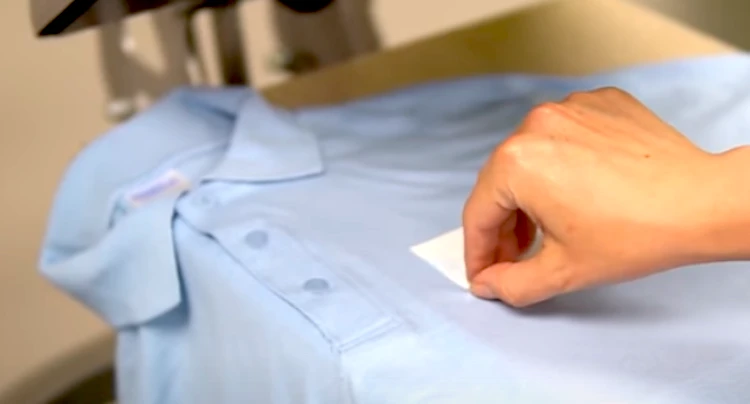
Note: Logos aren’t always square (having the same width and height). If your logo is wider than it is tall, make the width of the logo 3 inches.
Watch this video: Where To Place A Left Chest Logo On A Shirt [08 mins 44 secs]
Adding An Embroidered Pocket Allows For More Creativity
If you want to have a design that is more creative, you may, of course, choose to have a bigger design on the center chest of your T-shirt, or you can choose to have a collar, an embroidered pocket, or sleeves added to it. When printing on long-sleeve T-shirts, the standard logo size has to be increased by a half-inch in order for the 4 x 4-inch picture to be able to fit on the garments. This is necessary in order for the printing process to be successful.
If you want to construct a shirt that has a popular embroidered pocket on the left breast, you may still place your logo there. However, you will also need to take into consideration the size of the pocket. You should leave at least half an inch of space between the left chest logo on the pocket and the sides of the pocket. This space should be measured in millimeters.
If you don’t want to do standard sizes and you want to create an oversized shirt, you need to check that the design is placed properly on the shirt and then move it half an inch closer to the middle of the chest. This is the only adjustment that has to be made. Because the logo will be stretched out, this step is essential.
What Happens If You Desire A Larger Version Of The Logo?
Prints with dimensions of precisely 5 inches by 5 inches have just recently begun to be manufactured by designers. There has been an increase in the number of sales of women’s t-shirts with this logo size, which have designs and printing with not quite the perfect placement.
Shirts and other types of clothing for women generally include designs that cover the whole front as well as the upper back when they are this size. Because the positioning of large motifs may truly make or break the overall appearance of the dress, it is extremely vital that you choose the right arrangement for them. Having said that, smaller left chest designs are still the more popular placement.
Author’s Final Thoughts
There is no hard and fast rule dictating where a logo should be on a t-shirt. Even if you decide the left chest is the best placement, there’s still no exact location for the brand, or what size it should be for that matter.
Although this guide helps to point you in the correct direction, I would personally recommend using photo editing tools, many of which are free. You can place a template of a shirt and mess around with the logo location and size.
Further to this, with software, you are able to incorporate colors to see what goes or clashes with your brand design.
Play around with the location and size of the design and go with your gut instinct of what you feel looks good. You may find that the final product does not look as good in reality (compared to the computer generated model), but that’s fine, you just adapt from there until you get it right.
No one said it will be simple!
