Plastisol ink is known for producing bold, durable prints, but many screen printers notice the same confusing issue: the ink often looks lighter, darker, or slightly different after full curing.
This color shift isn’t a mistake in mixing or printing; it’s rooted in the chemistry of plastisol itself. Understanding how heat affects pigments and PVC resins explains why your print doesn’t match what you saw on the palette.
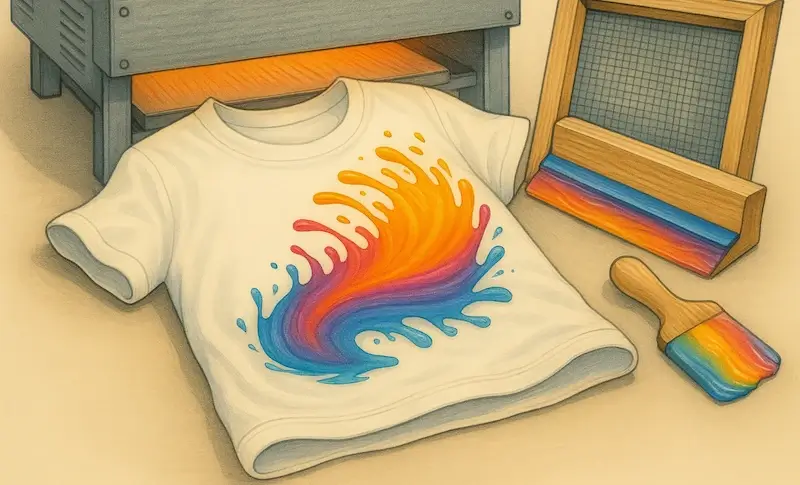
Why Does Plastisol Ink Change Color When Cured?Plastisol ink changes color because heat during curing alters the transparency of the PVC resin, the way pigments reflect light, and the density of the ink film. As the ink reaches 320°F and the resin fully fuses, pigments become more visible or less visible depending on their type, causing colors to darken, brighten, or shift tone.
In this article, we breakdown the science behind plastisol color shift, including how pigment load, ink viscosity, curing temperature, and ink film thickness influence final appearance. By understanding the chemistry and mechanics, you can better predict color outcomes, prevent unwanted shifts, and achieve consistent results across multiple print runs.
Key Takeaways
Color shift happens because heat changes resin transparency.
As plastisol reaches curing temperature, PVC resins melt and become more transparent, revealing more of the underlying pigment. This often makes darker colors appear richer and lighter colors appear deeper or more saturated.
Pigments behave differently at high temperatures.
Some pigments brighten when heated, while others darken. Organic pigments tend to shift more aggressively, while inorganic pigments stay more stable during curing.
Ink deposit thickness affects final color.
A thicker ink layer traps more light and increases perceived saturation, often making prints look darker after curing. Thin deposits may appear lighter because more substrate shows through.
Under-curing and over-curing produce different shifts.
Under-curing can leave ink chalky or lighter than expected. Over-curing can scorch pigments, deepen color, or shift hues entirely, especially with reds, blues, and low-opacity mixes.
Consistency requires controlling heat and ink variables.
Predictable color results come from stable curing temperatures, accurate dwell times, consistent squeegee pressure, and using inks with reliable pigment loads.
Color Shift Happens Because Heat Changes Resin Transparency
Plastisol ink is a heat-reactive material made from PVC resin and pigments suspended in plasticizer. Before curing, the resin is opaque because the PVC particles are solid and scatter light. At this stage, light transmission is limited, so colors often appear flatter or lighter on the screen or palette.
As heat exposure increases and the ink approaches its resin melt point (around the plastisol fusion temperature of 320°F), thermal activation occurs. The PVC resin undergoes molecular softening and a resin phase change, fusing into a continuous polymer film. This shift in polymer behavior under heat increases resin clarity, allowing more light to pass through the ink layer.
Once fused, the ink film becomes more translucent, changing the balance between opacity vs transparency. Increased ink film translucency means pigments reflect and absorb light differently, which is why colors often appear deeper, richer, or darker after curing. This effect is not a pigment change, but an optical one caused by PVC resin fusion and altered light interaction within the ink film.
Pigments Behave Differently at High Temperatures
Not all pigments respond to heat the same way. Pigment chemistry determines how stable a color remains once exposed to curing temperatures, which directly affects color integrity after printing. Even when inks are fully fused, pigments themselves can undergo chromatic change.
Organic pigments are typically more heat-sensitive, meaning they can experience hue shift, darkening, or brightening when exposed to sustained heat. Reds, yellows, and some blues are especially prone to thermal degradation, where excessive temperature or dwell time reduces colorfastness or causes subtle pigment burn.
By contrast, inorganic pigments offer higher heat tolerance and better pigment stability, making them less likely to shift under normal curing conditions. However, extreme heat can still trigger oxidation or alter pigment dispersion, changing how evenly color particles reflect light.
These differences in color reaction to heat explain why identical curing settings can produce different results across ink colors. The final appearance depends on how each pigment withstands temperature, maintains dispersion, and resists chemical change during curing.
Ink Deposit Thickness Affects Final Color
The amount of ink laid down on the garment has a direct impact on how color is perceived after curing. Ink film thickness controls print density, saturation level, and overall print opacity, which determines how much of the underlying substrate influences the final color.
A heavier ink deposit, caused by lower mesh count, increased stencil thickness, or higher ink load, creates greater coverage depth. Thicker print laydown increases light absorption within the ink layer and reduces light scatter, making colors appear darker and more saturated. This effect is especially noticeable on mid-tones and darker substrates.
Conversely, a thin ink layer allows more substrate show-through, lowering print density and lightening the perceived color. Variations in layer buildup from print to print can therefore create visible color inconsistency, even when the same ink and curing conditions are used.
Under-Curing and Over-Curing Produce Different Shifts
Accurate curing depends on staying within the ink’s cure window, where temperature control and dwell time are balanced. When curing falls outside this range, heat-related defects can cause visible color changes that are not tied to ink formulation or print setup.
Incomplete curing occurs when heat exposure duration is too short or temperatures are too low. This can result in fusion failure, leaving the ink surface chalky or muted and reducing color clarity. Prints may also feel soft or unstable, signaling cure inconsistency that affects long-term durability.
Overheating has the opposite effect. Excessive heat or extended dwell time can cause thermal damage, leading to color distortion, darkening, or scorching. In severe cases, pigment burn-off or increased brittleness occurs, permanently altering the printed color. These outcomes stem from heat imbalance, not normal curing behavior.
Consistency Requires Controlling Heat and Ink Variables
Achieving reliable color results depends on process control across every stage of production. Variations in production variables can introduce subtle shifts in color, even when the same design and ink are used.
Maintaining temperature consistency through proper conveyor dryer calibration and flash curing control ensures each print reaches the same curing conditions. Inconsistent heat application disrupts print repeatability and leads to unpredictable outcomes across runs.
Ink-related factors also matter. Stable ink formulation and pigment load consistency support accurate color matching, while uniform squeegee pressure helps maintain a consistent ink deposit from print to print. When combined with a standardized workflow, print environment stability, and routine quality control, these controlled curing conditions allow for dependable color and long-term print consistency.